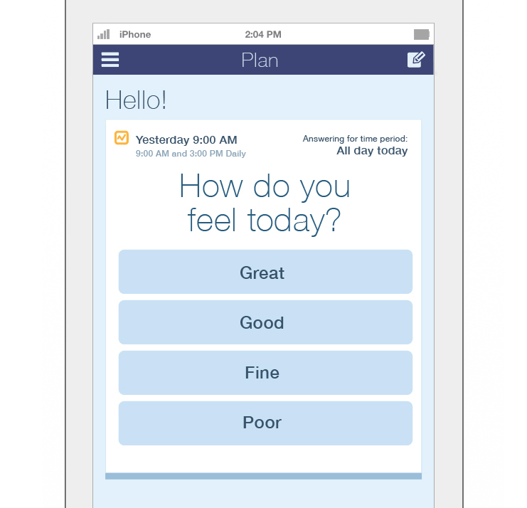
The New York Review of Books is one of — if not THE — most intelligent papers in this country. They get the big thinkers to take a few books, articles, movies, what have you, from their respective fields, and write insightful commentary that contextualizes those pieces within the world around us and the times we live in, all wrapped up in a “not-quite-a-magazine, not-quite-a-newspaper” floppy saddle-stitched volume every two weeks. The writing is smart, crisp, engaging — Elements of Style all the way. I feel like my brain is growing when I find the time to read it.
However. But. Nonetheless. Strangely.
The graphic design leaves everything to be desired. The cover is a train wreck—no rhyme or reason, no structure or rhythm — where random photos float around even more random type set in either an all-caps aggressive sans-serif, in red (100% magenta, 100% yellow), or in some god-awful clichéd font. The design is neither rational, calming order nor effusive, exuberant disorder, and none of it is easy on the eyes. If I saw any of their covers for the first time, I would assume it was a tabloid or an advertisement for a motivational speaker. Today I focus on the cover, but that is not to say that the interior is without design flaws (the table of contents — dreadful!). And the sizing. But one critique at a time.
I have thought a lot about how it could be that such a profound publication—wherein a great deal of care and thought has clearly been expended—ended up with such an awful design. I did some research. I found out that it started in 1963 during a printer’s strike in which the NY Times had ceased publication and the intelligensia was getting fidgety. I found out who started it and who has written in it (famous, interesting) and other historical notes, but I haven’t spent enough time on Google to answer my burning question as to the genesis of the design. I thought perhaps they wanted to demonstrate that it doesn’t matter what you look like on the outside, that one’s inner beauty is what is important. Strangely, their website looks fine, even nice. Aside from their logo. (But that is another story).
Where am I going with all this? Well, a BEFORE and AFTER, of course. Who doesn’t love a BEFORE and AFTER? I’ve added a few articles and changed a few images, but it’s basically the same content as the original June 24, 2010 cover. The NY Review (of Books) only has 135,000 subscribers, a drop in the American sized bucket. I can’t help but think that if they spent some energy on improving their design, maybe they would attract new readers. You think?
/// mpc
BEFORE:
AFTER – now, with more color –
© 2010 Martha Cooper Design

We just launched a website for Lawyers for Clean Water, a small environmental law firm with offices in San Francisco and Santa Monica. The design is clean and friendly, capitalizing on the otherworldly beauty of underwater photography. This 6-page site with text, photos and a video, and without any fancy user engagement or ecommerce, cost less than $2K! Including programming! And the client can update it by themselves, thanks to the genius of WordPress. Check it out for yourself if you’re curious: Lawyers for Clean Water website. Thanks, once again, to Otis of Example7 for his brilliant coding.
Just finished a bit of event branding for Olive & Page’s Summer Sale. Olive & Page is a paper-loving and real-ink-pressing sister company to Martha Cooper Design.
Come join the fun — there are really beautiful letterpress cards for a steal at www.olivepage.com.
/// MPC
Every once in a while I get a wild hair and do some sort of 19th-century handmaiden-type project, usually involving hot pink sewing thread or baking chocolate. Not sure where this impulse comes from, but perhaps it has to do with the fact that my two-year-old does not like it when I sit in front of the computer. Here is my newest doodle: Quack.
I sewed over the felt many times with swooping lines to mimic the motion of water and to nail down the shapes. At the bottom, hard to see, are fish:

At this point in my post, I would normally explain the rationale, the deep thinking behind this brilliant creative concept. But today, it’s just: Quack! My daughter likes ducks.
I am so excited about my new logo, identity and website I can hardly stand it.
I wonder if most of this elation is actually relief, because this is the result of a very long journey indeed — like hiking up a tall mountain, in winter, barefoot.
Hell and death, it is hard to design your own identity. The writer/designer’s blocks! The self-doubt! No matter what came into my head, I would dismiss it as being too quaint or cheesy or boring or inappropriate. No wonder people hire someone else to design their logo. It’s downright impossible to self-analyze and self-promote, and not be self-crippling. I think it took me a year of hemming and hawing, but finally, here it is: new logo, new identity, new website. Hurrah!
Thanks so much to Otis at Example 7 for doing his PHP-CSS-Wordpress magic; he’s endlessly patient, ultra-professional, enthusiastic, and just about the nicest guy you’ve ever met.
WordPress! What a miracle. Client’s say it’s easy to update, coders say it’s easy to tweak, and designers say “what a relief!” because the final site looks as it was meant to, instead of having to make design concessions to the code.
And finally, thanks so much to my design group for giving me great feedback when asked: Viv, Jillian, Heidi, Rena, you’re all the best. To anyone already on their own or looking at going independent, I highly recommend meeting with a group of your peers monthly to trade ideas, critique each others’ work, moan about the economy, share vendors. It has been a truly inspirational force in my professional life, and I can’t imagine not having that kind of community to look forward to.
I volunteered to do a banner for The Carberry Club, a Brown alumni group here in the Bay Area. Although I’m not an illustrator, as is clear in the image below, I had fun doing it!
The Carberry Club is a more intimate alumni group than, say, the Northern California Alumni Association; it’s more casual and highlights intimate dinners of alumni and their friends. This group has a special interest in networking entrepreneurs and start-ups. So if you’re a Brown alum in the Bay Area, come on down.
Our client Tutti Foodie, who runs a website and puts out a weekly email compendium of news all about food, also creates and manages sweepstakes and contests. One of the contests we did together was the Chocolate Adventure Contest with Scharffen Berger Chocolate. We designed postcards, web banners, trade show graphics, you name it. And what’s best of all, Tutti Foodie sent us chocolate at the end! Thanks, TF!
Here is the postcard:

Some web banners:
Tuttifoodie also ran an Australian Wine Lovers Sweepstakes — a trip to Australia to tour vineyards with three friends! We can support that. MCD came up with the concept of the animal most closely associated with Australia, the kangaroo, stamped on a wine cork emerging from a bottle of wine. The color palette evokes red wine and warm desert.